Thursday, 28 June 2012

Workflow.

I've been a little lapse with posts recently; although thats not through lack of work or effort.

The majority of my time has been spent playing with the editor (and pestering Ben) as well as working on a super top secret Spin-Doctor website with Gina; which is almost done. I've also been drawing alot more, although that's just side projects nothing of which I really want to share on the blog just yet.

Although there are these rough sketches:
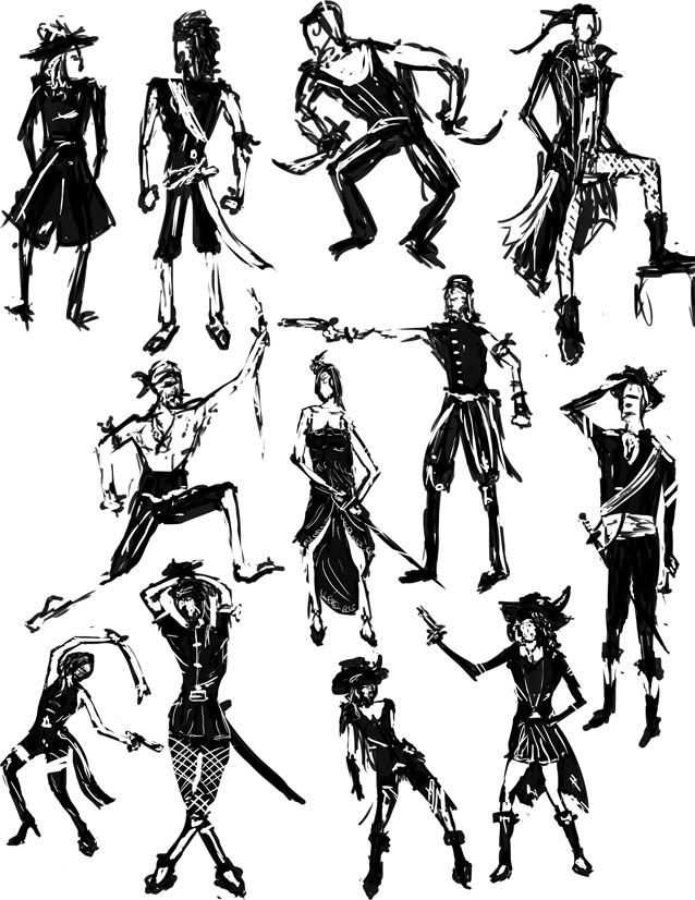


Ill try and get some more art updates soon. I am also planning an update with my experiences using the Engine and Editor and perhaps some gameplay of Spin-Doctor; at least my personally created stuff. (Mad props to Ben)

For now, I'm going to try and finish off the website which should be done in a week or so, certainly in time for the Alpha and hopefully in time for MCRGameJam which I'm still waiting for an email back from.

So if you`re MCRGameJam and reading this, email me back man, seriously.

Later. 


Tuesday, 12 June 2012

Bit more Art, nothing much.


I rushed this a little because the time I had set aside to do some work I spent playing Max Payne 3:


Anyway, I whipped up a cushioned platform in 3DSMaxPayne  for the player to land safely on without taking damage.

These, specifically for the Medical Zone, are meant to emulate the walls of padded cells found in insane asylums.

Perhaps this message is lost a little with the perspective, so I'm thinking that maybe some wall decals need to be added to the background to indicate further that the platform is cushioned.

Not sure, have to see how it looks in game maybe we`ll get away with it. 


There are two different versions since I wasn't sure what style of cushion looked best. I liked the dipped cushion better although the difference is that minute it really doesn't matter.

Both versions are in the groups folder so I suppose they are just variants that can be changed in game.

Thats all I've got for now, working on some new platforms and things which Ill upload as they are finished.

Lots of assets getting churned out now by the artists so its looking pretty hopeful we should have a nice looking game by the time Alpha rolls up in the coming weeks.

Ill do another stock count of what we`ve got done and still to do in a few days.

How wonderfully exciting. 


Monday, 11 June 2012


Happy to get the paper level design stuff stacked so I can focus a little more on the art.

Having trouble getting myself motivated with this; a little stuck creatively for ideas.

That being said, seeing how well Harry is getting on I've tried to muck around a little tonight.

First up, I made a new platform:


Nothing really amazing, I was just trying to get a more concrete feel which looks more akin to the Medical zone.


Not thrilled with it, but it pays off to have variants of platforms so Ill keep it and make a few more later. 


I'm getting really lazy with the texturing; opting to do the majority of the work in Photoshop since half the effort I WOULD have put into 3D is wasted in the 2D game. Shame.


Anyway, with the platform made I mocked up this little idea I had:


Rushed it towards the end and left off some parts I wanted to add like cogs and a candle; I also nicked the steam gauge straight off Google.

Lazy lazy.

This was only a concept but I sort of liked the idea of it, would look funky as décor in levels.

Made a few different ones with various different X-ray scans:


I also made a cracked screen one although again, that was just with a stolen texture. Made this quickly because I wanted it to be a concept but unless anyone has any objects, Ill probably just leave it as is.

Maybe make my own broken glass though, not sure.


Thats all for now, I should probably do a wrap up of the Design work but it wouldn't be much of a post.

Hopefully much more art to come in a few days.


Cheers.

Tuesday, 29 May 2012

After my test concept I decided the door I had done really wasn't fitting for the Medical zone so I mocked one up in 3D / Photoshop.

Just for fun I went about this a different way I would normally texture in that all the texture was done in photoshop with overlays.

Makes for a different result than what I would have been able to achieve in 3D which isn't always a bad thing, although I dunno.

Door is below anyway; the grey-scale is what I took into photoshop and the textured one is what I finished with.

Also shown in the earlier level mock up for comparison. 

Starting sketches

Untextured


Final

In-Game Concept


Monday, 28 May 2012

Head was frazzled so I decided to do a little modelling for fun instead of college work all the time, plus Im sick of 2D stuff. 

Its lame.

Stayed up till 4am then to make a Gun, LOL.

Its a Beretta; I wish Max Payne 3 was out on PC already....

Might texture this if I find some time, I have unwrapped it although only roughly. 

Want to have a go at hand painting it although Ill see how I feel, be a fun exercise in texturing anyway.
Assorted images below.


Ill crack on with Spin Doctor stuff tomorrow, now I'm going to sleep.


Sunday, 27 May 2012


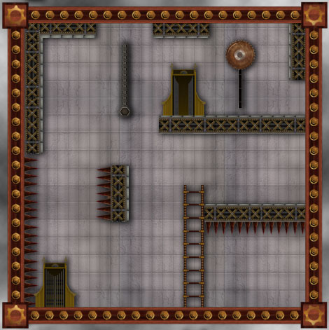
Seeing Benjis level concept thrown together with his assets, (which looked awesome btw) I through together the assets Id made (chain is Benjis, Spikes and Saw Blade is Harrys) and a few from others I needed to complete the level.

Was a test, just to see how well things worked together.

Horribly, is the answer, if you were wondering.

Things look really out of place to me and I don't like it. Nothing blends well. I've decided I need to make a new door for the Medical since my current one isn't fitting in style and the background, I'm lost with. Will do for now I guess until I get some inspiration.

The square border looks far to clean, I am aware of this and its on my to do list.

I'm not that unhappy with the platforms, although they are still meh.

In order to place the assets better in the level I added a slight drop shadow. I rushed it and its too strong in areas, like the chain, but I needed that to stop it looking so flat.

I'm not sure how we can go about this from a programming perspective. 

The only plan I've got is to render drop shadows on all individual objects and save them off as PNGs, hopefully being able to use Opacity data inside the Engine. That would be a rough way to solve the problem but could look a little off, would need to test it in the engine. 


Anyway, whatever, the concept:
Any excuse to use Harland Shears in an image:


All so very Meh. 

Meh, Meh, Meh. 


Saturday, 26 May 2012

Assorted items, again lazy texturing; sprucing them up in Photoshop is the name of the game. 


Friday, 25 May 2012


Trying to do some art, but I cant really get focused with it.

We need a square girder to contain the room, I just wanted something simple that didnt take to much attention away from the player but was still fitting with the theme.

Heres what I'm working on anyway, Id like Ben to put it into the engine so I can see and take it from there, but I fear in the interests of time and speed it might have to be as is.

Sloppy as fuck with the textures, I just cant concentrate and there is no way I can Unwrap right now, heh.

Yay for Gizmo.

/thatwilldo.

My first draft of the square room boarders, just threw some textures on there and rough designs to get a feel for how I wanted it to look. Pretty lazy but it was a starting point.


Decided that a more wooden and bronze look would be better suiting to the style of the game, although I feel this can be changeable depending on the level. (With each level having its own theme.) This means the wooden version is probably better suited to Level 3 which is the Mansion Zone, although can exist as standard for now.


Im going to grunge these up a little since they look too clean, but I figured that would be an easier task in photo shop rather than putting that detail into the texture work; which I dont have the patience for right now. 


I want to see how it looks in game first and then continue with this, right now Ill get on with other stuff.


Tuesday, 22 May 2012

Started a few levels going to finish the first iteration of them all tonight I think. Ill upload the few I've done quickly now.


No idea why blogger feels the need to rotate them for me, but Ill fix that later.


Room 1
 This first level below was one of mine, played through it and decided it was to brief and to easy to complete. Whilst there as a little element of puzzle, one figured out the level would last only a few seconds. Which is boring.

I've added in a few extra traps in areas to make it possible to die in the level, aswell as removed two of the doors so you cant get stuck.

I plan to go over this level again a second time and try to beef out the puzzle factor to it somewhat, make it more of a challenge.


Room 2
Next up was on of Adams. Mainly I changed a few problems with height and location of platforms. I moved the ladder higher up in the latter half of the level to make it more of a challenge traversing the land. In terms of redesigns, I made the initial falling platform trigger activated via a wall switch aswell as moved the location of the note so its more accessible to the player and covers some dead space.

Make second run through of this I want to focus on the latter half of the level and make some additions.


 Cross 1
One of my cross sections. I couldn't find anything totally wrong with this. The design works but it might be a little short and not keep up with the spirit and point of the cross sections. I might ask for some additional eyes to look at this and see what they think.

Some additions I made was adding a trap door rather than an open panel triggered via a switch. This just means the cross section lasts that little bit longer and encourages the player to explore more. 


Cross 2
This was one of Marks. I actually really liked this one and didnt feel many changes were needed at all. The onyl problem I found with the section was the moving platforms would move too close to the walls, blocking to fall path of Harland. This is easily fixable by haulting the moving platforms just before the edge, letting the player jump down. 


Ill get the rest done for tonight and arrange them into presentation form for Wednesday. Then with these done and after Wednesdays lesson Ill go over my work and make any further changes.

And then do some Art, lots and lots of Art.

And play some DayZ, lots and lots of DayZ.

Sweet Success. 


Thursday, 10 May 2012

Paper Doctor

Levels all drawn up.

So it begins...

Tuesday, 8 May 2012

Spritesheets


Finally decided to get around to rendering off the spritesheets for Ben.

Poor guy had to dissect on of my GIFs for the images.

Anyway, Ill post them up here for everyone to see, although for those that NEED them they are in the group dropbox.

Was a grind to get these spaced out evenly and after much trails and tribulations; I managed to find an awesome dude who had written a Java script for Photoshop to do it automatically.

Had to jimmy rig it a little and manually change parts of the code depending on image sizes and frame numbers, but it was still much quicker than a manual job.

Ill load them all in below:


Idle 1


Idle 2


Running


Jumping


Climbing


Falling

The Death animation is done, I just need to get it form Gina and sprite sheet it up, then we`re good to go.

Hopefully Ben can work some programming magic with this and make it look awesome.

Next I think Ill get on with some design work, I wonder, does updating my blog with art come under the 3 times a week rule?

Who knows.

Thats all for now. 

Saturday, 5 May 2012

Assets Begin

Working on some texturing of assets.

Texture up the platform just to get a feel for how I wanted it to look. Was pretty pleased with it so I think Ill keep it as it is even though it did start as an experiment.

Going to do a few like this, using similar textures and colours which will make up the bulk of the plat forms in my Level of the game, Medical.

Walls are up next though, can worry about pimping out this stuff when we have more assets.


I also made a door. Wanted to go for like, a 1950s Hotel Elevator style thing. I liked the idea of sticking to the original way I was drawing the doors, since it has become standard in our level design docs. Seems nice having this door follow suit.

Lots of brass and stuff. Will be easy as pie to animate if we decide we want Harland to animate into a room, (which I still think he totally should.) since he can raise from the bottom of the elevator and simply step through the sliding doors.

I might whip that up if I have time because I want to see what it will look like.

Thats all for now, these were pretty time intensive, full normal mapped up and stuff as well, would you believe.


Thats all for now.

Monday, 23 April 2012

Just finishing off the ladder climb animation after making some alterations to the Idle loop, looks a slight better now.

Ladder climb looks OK, nothing amazing. I've included how it might look on a ladder in the GIF, although I've come to the conclusion that all of our ladder sizes must be the same size and the speed of the animation will be dictated by the size of the ladder, with 2 rungs per hand / leg movement.

Cross that bridge when we come to it though mind...


Going to work on a few more animations, Ive realised we need a falling loop aswell to play after jump but before landing.

Shit, do we need a landing animation or does it go straight to running?

Feck.

In any case, still on my list is:

- Falling
- Death (Gina has worked on some)
- Tweaks to Jumping
- Enter / Exit Room (Will depend on door types, yikes.)
- Swinging
- Grabbing Objects

List keeps growing....

Thursday, 19 April 2012

Trying to write of the idle animation.


This was tougher than I thought it might be, since I don't really that many frames to use (trying to keep it under 24 for each animation) and the fact the idle animation has to loop, means there isn't much I can do.


First one was just like, a breathing cycle. Would happen when Harland is still. I like it to an extend and feel like it does the job, but the hand looks so out of place. Might tweak this a little if we use it.


This second one looked a little nicer, more suitable for when Harland is tired or injured. I think it worked much better an an animation. perhaps we can have both in the game and its conditional or random to which animation happens when the player is still. Be nice with a little variety. 


Going to try and work on the ladder climb animation tomorrow and FINALLY RENDER OF THE SPRITE SHEET.

Laziness.

So much laziness. 


Tuesday, 17 April 2012

Doing the jump.

Its tough.


WHY IS IT SO COMICALLY FAST?


Doesn't look very fluid and its a little outrageous.

Trying to get it smooth with the run animation, this is how it looks in tandem:

http://jonii-gakou.deviantart.com/art/Jump-Harland-296708505

Had to link it there since Blogger wont handle SWF files and I couldn't be bothered moving the whole thing to Photoshop just so I could keep the colour palette in my GIF.

Flash kept fucking it up.

_______

Thats how the animation is staying for now, so if you dislike it (Sam) you are welcome to try yourself or lay off.

Ill burn through the next two which is Idle and Climbing and probably come back to the animations when Im less swamped with the other Art assets.

This will do for now.

Tuesday, 27 March 2012

This is one of mine.


Thanks Emel for the help and advice.

Will make the sprite sheet late when I work on the jumping and remaining animations like ladder climb etc.


Friday, 23 March 2012

Current Progress on Level 2.
We have 8 Rotating Rooms.
We have (so far) 6 Cross Sections.

Tutorials List

Will List all the Tutorials here as I make them:

3D
Texture a Harland Shears: Unwrap UVW Character Tutorial

Tutorial: Unwrap UVW

Thats right, Im doing tutorials now.

Friend of mine asked me about Unwrapping.

Whilst I didnt make the tutorial specifically for him, I did make one for the blog and my own benefit.

Since I forget easily.

Let me know if this helps ANYONE.

And ignore the spelling errors, I simply dont care. 

*View and large and download to follow it.*

DOWNLOAD LINK HERE.


Having some issues not screwing up the Res from blogger.


Thursday, 22 March 2012

Here are some videos of animation and texture in tandem using MoCap data as the animation; not mine.

Was just going to do the one animation, to test mainly the rig and textures moving together.

I realised early on that without a decent lighting system in place, the models look much worse than they actually are.

Which sort of explains Frostbite 2....

In any case, the first video of Harland hopping is my second render, which looks more akin to what the final sprite sheet will follow.

I was happy with the lighting, just needs a few tweaks in places but overall I think its looking none to shabby.

Will be finishing the texturing and making any amendments when I next get a break from Design work.

Hopefully Harland is looking up to scratch so far with everyone, still unfinished at the moment.

Cheers.


Progress so far.

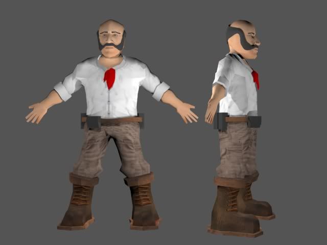
Will be finishing this off soon, rough now, need to blend some of the textures, particularly around the neck and head areas, as well as finish a few off like the scarf and packs.

Going to rough him up a little as well, looks clean coot at the moment. These aren't the final textures, I was just testing out my Unwrap, working on it.


Ok so I think this is about as much as I can obsess over this model without pushing it a step further.

Happy with the rig, some issues around the leg and pelvis areas I'm working on cleaning up, although you don't see this in my run animations.

Getting to work on texturing now.


Tuesday, 20 March 2012

Shouldn't need words to describe.

Just rendered this out as a test, can solve any problems with the Sprite Sheet now whilst I get to work on texturing and tweaking the animations.

Whole image size is 3390 x 816.
One Harland is worth 226 x 272.
32 Frames.


Monday, 19 March 2012

I hate animation.

Managed to get this done, sort of.

I'm working on getting rid of the jump / jolt between repeats but im stuggling with it.

Got it down to this, its still pretty noticeable but its better than it was. 


Saturday, 17 March 2012

Rigging and Animation has plenty of problems.

Most of them annoying.

Some of them hilarious.