Friday, 28 October 2011

So this was this:


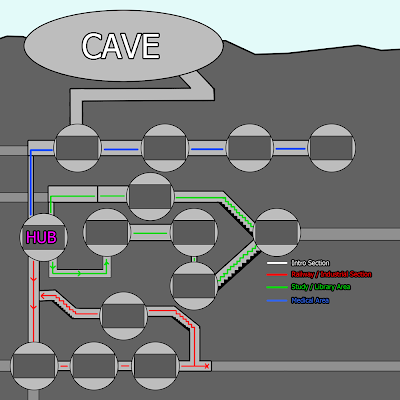
So this was my priliminary for the overall level map, which Ill get to later.

Now, Ive taken a lot of creative license with this, since we needed some decisions making. We can default to this if we need, but Id rather people tell me their thoughts. I don't want to spend hours drawing up the final version for someone to tell me they dont like certain areas.

Point being, this is happening unless you tell me not to. So, speak up.

Interludes:
This was a new feature talked about last lesson. Came about as a way to inject story as well as suggest that the facility is built within an actual place. Which means there wouldnt just be a string of rooms, the player would have to take corridors and paths etc.

These sections will be corridors and rooms like living quarters, service rooms, lavatory, laboratory (ha), library, study etc. Things along these lines as well as the testing rooms using a similar style since its set within the same connection of rooms.

Meaning the medical section will feature medical themed interludes and test chambers.

INTRO:
Intro follows the theme of the previous post, ending with the player dropping into one of the testing facilities at the medical section of the game. Its in this area the player gets their first glimpse of the world before either blacking out or being attacked / subdued by the Doctor.

HUB:
The player moves to the HUB world, which is the focal point for the game. I thought it more like a living quarters in design and style, which is why I placed it in the Green section. Although up for debate.

Section 1 (PROTOTYPE):
This is the most important section as these 4 levels including the HUB is what we will create as the games prototype, so this section alone needs to be refined down perfectly prior to the other sections, at least, this bit if more important.

We don't have level designs, but I was thinking a transition into this section comes from an elevator shaft. Player enters the lift and it collapses down, ending in dust and smoke inside the first testing chamber.

From here, the player takes on each of the 4 levels with an intersection of exploration between, which will be railway / industrial themed rooms holding the games story elements.

Finally, the player is able to escape from the main railway line and double back to the elevator shaft, climbing back up via the cables OR rotating the whole shaft and walking down, I like that idea but it doesn't really fit. But who cares.

Section 2 & 3:Ill be brief here because I just made shit up honestly, simply for filler, I want feedback.

Section 2 takes the player through the library and old living quarters of the Doctor, so a more personal section of the game. The player will see medical texts as-well as gain an insight into how the Doctor Lives, some of his work (via newspaper articles and such) as well as his physical appearance.

Finally for the Alpha version of the game (possibly), section 3 will take the player through the medical / hospital rooms which some have been converted to test chambers. The cross section interludes between these rooms will see unlucky victims etc into the Doctors research.

Section 4 (Finale?)
The prototype of the game will feature an ending? If It did, I was thinking the route the player takes would finish in the area the Doctor is calling home. (I thought it fitting to be after the Medical section since the Doctor will presumably be with his wife.) Not sure how this will play out, give me ideas.

____


This was my 2 Cents for the GDD. I will be actually drawing up the whole world including level designs and rough elements in the interludes, soon.


Sam is in charge of these Level designs for me, although we need all we can get at this stage. Whilst in theory its the Designers role, if anyone has any rough sketches or ideas for Levels or traps make them heard now. This is GDD related stuff so if you want it in there, speak up.


Anyway, this post has suggest some pretty drastic stuff for the game idea and like I said, most of it I just took the buck with.


So please, do what we`re meant to be doing and tell me if you don't like these ideas.


Facebook or leave a comment, whatever.


That's all for now.

Sweet success.

Intro?

Started to plot out the entire map as decided during last lesson. (Me, Harry and Sam doing the Level aspects for the GDD) Wanted to begin just by working out how each section would intertwine, this became difficult without a solid foundation for the initial mine section, so I just threw something together.


Let me know what you think, its not really action orientated since its just meant to be an opening sequence to the game but, my idea, was to have the transition from daylight to utter darkness be quite striking, eventually leaving the player in utter darkness with just the light from the Dr`s Labyrinth at the end.

I thought that descent into darkness was a subtle way to inject the tone into our game, although it doesn't come across that well in this storyboard.

What I was thinking though.


The whole level working as a giant image is below, although its only a Concept.

Going to stick with this rough SHAPE for the mine whilst I plot out the rest of the levels and where they exists within the worlds space; Ill be uploading a rough map of this soon before I take it into Illustrator and plot it out exactly once people have OKed it.


Roughly estimate about a minute, possibly more, to play through this opening section. Which I think would be a cool time to run the opening credits.

Sort of along the same vein as Splinter Cell, the blackness of the cave walls, as the player passes, could have the names of us as we contributed. So like, Designers, Artists, Programmers, etc.

Although how that exactly would look remains to be seen, I just really want to play Splinter Cell.


Also noticed Controls on  Khal`s Blog.

I've had my own thoughts on that which I think are enough to post since its different, so Ill make a post about that later.

Thats all for now.

Wednesday, 26 October 2011

Environment?

Started off pretty hopeful  but I've sort of trailed off since then.


Less of an actual environment design and more the early stages of what will become the level design, this was meant to be a concept of the Hub world, although I just included one door to get the overall setting and feeling.


Not finished with it but I am loosing focus. 


Was difficult to imagine how the mechanics would work, but doing this has given me a few ideas.


Tuesday, 25 October 2011

This is unfinished, but I'm tired.

Meant to be the wife character looking a little less "cut your wrists" a more of the style I wanted.

Need to finish drawing some of the steam punk apparatus around her as well as add a dress and some decaying cloth (she didn't die naked after all...)

On top of that, Ill need to draw in the mechanical heart which wouldn't have decayed, stupid metal and stuff.

Tuesday, 18 October 2011

Well, I have been needlessly active today on the old blog today.

Did some rough as hell environment sketches, I'm not really comfortable doing these and I think the results were a mixed bag:


Didn't really have an idea in my head, I was just drawing to see what came out. Majority of it I think is useless but I really did like bottom left and top right (2 & 5) and I think Ill be doing some more like that when I get the chance.

My biggest problem is drawing in the 3D perspective, I just think I can work better in 2D. This is a huge problem for me as an "artist"  but not a hindrance on the project since its 2D anyway!

So I struck it lucky there. Going to put some more effort into actual Designs of rooms next chance I get, be interesting to see if I can draw the mechanisms for the rotating rooms. I didn't realize how challenging it was to visualize such a thing until I came to actually draw it ...

That's it for now though. I need to go to sleep...
Spending sleepless nights on Youtube.

Doesn't this game look awesome?


I really love the style of it and the concept is something really interesting to me.

Some good inspiration I think for the style and tone of our own game, I think something we need right now.


My heart wasn't really in it.

Dunno lol

Sunday, 16 October 2011

Oh, I also did some 3D to! LOL


I did ATTEMPT some texture work, but I feel as sick as a dog so I didn't focus with it long. 


Main problem I had wasn't with the texture work per-say, but just general amateurism with the pelt mapping, ill try again later, going to use the model as anatomy for my character sheet though. (When I get around to it.)


Thought Id carry on updating the blog with some research I have been thinking about before tomorrows Art lesson; regarding the "Art Direction" or style of the project.

http://www.moma.org/interactives/exhibitions/2009/timburton/index.php

Since we haven't really spoke about this as a class, I'm just going to go ahead and do my own thing.

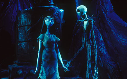
I'm thinking in fitting with the dark and gloomy environment settings as well as the pretty bleak story, Tim Burton (a name I keep mentioning) is someone who fits perfectly into the early concept. So, here is a random assortment of images from his work to give you the same ideas I was thinking:

Sweeny Todd:


Corpse Bride:


Nightmare Before Christmas


BeetleJuice


Vincent (Short film)


My input anyway, talk about it during Art class.


Friday, 14 October 2011

Actually made me a little depressed drawing this next one, which I will explain first since its a little macabre...

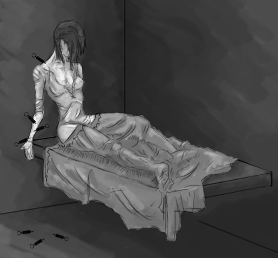
I really liked the twist idea spoke about in class, (Adam told me about it, not sure where it came from) in that the Wife of the Doctor has been dead for years, as I assume you would be being injected with mass quantities of artificial adrenaline; either that or wanting to run all the time. 

Or snort nasal spray...


 Anyway, with this twist in mind and my own thoughts on perhaps leaning this game more toward a horror / steampunk genre, (horror in the sense of the atmosphere, setting and story rather than ghosts and shit) I wanted to draw in an image of the deceased wife as a "mood concept" for the game. Which I know exist. 

That was way to hard though and this was the best I could muster:


I don't really like it.

I didn't think the "Tim Burton" esque style I wanted really came across much and it left it looking just a little, strange. Which is why I am hesitant to even blog it.

Not to mention the pretty shoddy work on the drawing; it was a sketch to begin with, I could just never get it pasted that stage.

Well anyway, the point of this was to hint a little but at the story and overall MOOD of the game. The mood I have in my head is a very dark and depressing one (what with the narrative being as such) so for that reason I'm thinking horror is a possible destination we could reach. Without really changing or adding anything at all...

To summarize, my thoughts on the art direction is to lean the game towards a horror / Tim Burton style with over exaggerated characters and environments.

I will continue to do this until I am either agreed with or instructed otherwise. Probably on Mondays Art lesson.

That's all for now, but here is some rainbows and bunnies to cheer myself up.


Better.


Thursday, 13 October 2011

Couldn't sleep, so I've been playing with this drawing:

Think the head looks, a bit off?
Started off in a very stylized way, my thinking behind it was it would translate much better into 3D this way as appose to the more realistic and not really character design stuff I've been doing previously. Plus, the game needs its own unique style anyway, so I thought Id try something new. 

Keeping in mind the Doctor character is meant to be old, I started with the mindset to draw a frail old man, hence the walking stick and weedy physique. Least that's how is started...

Leaving this unfinished for now, added the face of the previous Doctor I drew just to see how it would look, feels a little off proportions wise but that was because these drawings were never meant to be combined, I'm just a rebel like that.

I might potentially keep this and draw an older face for the image on the right, as well as scuffing up the coat and overall appearance of the suit. I did intend to start with that but something got lost in translation.

Also, defiantly a Jack Skellington inspired look going on here:


Hopefully, (if my attention span can last that long (I'm not holding my breath)) Ill be able to roughly model this chap in 3DS max, which I sort of have a plan for in my head already. Be interesting if I can mimic the style I want.


The plan is to make it pretty much the same as the concept image (allbeit with an older subject) and hand draw the textures with my tablet in photoshop. Although Ill belive that when I see it.


After watching Backwater Gospel fully I fell in love with the style and want to emulate it in a similar way. 


Going to muck around with the textures anyway, hopefully get a sketch style going on. That's my plan. I think if its done correctly it will translate well to the game idea, additionally the backgrounds and objects would like aces` hand drawn.

That's all I'm working on now anyway, I had a few other ideas for the Doctor character but nothing is going down on paper well. Hopefully once its in 3D I can be a little more creative.

That's all.


Friday, 7 October 2011

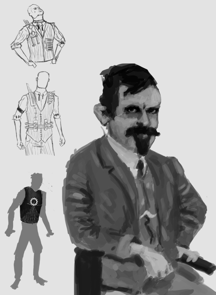
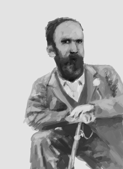
Saw a few photos that gave me a bit of inspiration and a change of heart for the Doctor Character. I am attempting to find a man that just screams super-villain the moment you look at him, without any flair or giant lasers or something. 


After seeing a photo of such a man whom would not look out of place torturing James Bond, I just had to draw the guy:


Turns out Goatees are the new evil.
There are some other generic sketches I was working on which I  got bored with fast. This guy was more fun to draw. Going to attempt at some actual solid designs now based of this fellow and thinking of scrapping my previous design; although I may keep the costume. (not sure)

Anyway, with that I also drew some more pictures Id seen, although started to loose interest after a while, don't think this image was ass successful:


If you really squint your eyes and really believe....

Wasn't as happy with my second attempt, although my first was totally super-villainy-ish; at least that's what I think.

Looking forward to doing some more drawings of this dude over the weekend.

Also, as a side note, staring at this guy I cant help but think of Paul Giamatti...but I don't know why...


Whats up Doc?

Could be something to go on.


Tuesday, 4 October 2011

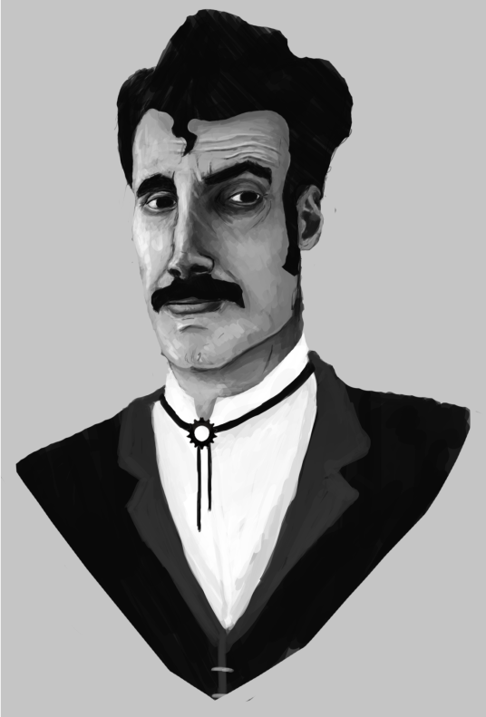
Started some character related concepts early, still focusing on the Doctor character at the moment although I have some thoughts for the player character that Ill sketch up some other time.

Spent to long on this, now my eyes hurt:


Uncle Alan, is that you?

Roughly based on the Doctor character, wanted him to have a evil super villain kind of twinge to him, although still being professional. (its the eyebrows that do it) 

Calling this unfinished for now, I want to go back to this and add a few elements Ive been thinking about to make him more steampunky, but I can use this as a base now hopefully and just add shit like goggles as freely as I want. 

The reference I got for this image was based on my mood board and the one and only Serj Tankian:


The man just screams super villain.

Been listening to System` recently and Serj seemed the perfect candidate.

That's it for now anyway.


Sunday, 2 October 2011

Uploading work as I go, here is the mood boards for next Art lesson:

Character:


Went for sort of a, realistic look? Lots of people in suits and stuff. Sort of conveys a Victorian era but there isn't much flare in the characters. Depending on how far we go with the steampunk depends on what machinery and stuff we can implement into the designs, but for now I thought this was a good starting point. 

Environment


Went for a sort of, dark and unsettled theme. Keeping in mind we wanted an underground setting, I looked at plenty of train tunnels and tracks, which I thought gave a pretty cool style. Likewise the archways and tunnels underneath Manchester were really fun to look at, added a few images to this. I'm keen to check out the tour myself...


New Manchester Walks

Objects:


Last up was objects, sort of struggled with this after I looked at Wild Wild West and watched a part of the film, which was hilarious. Didn't really have much motivation or direction, only thing that sprang to mind was the stopwatch which I felt was a cool way to handle rotation in the game.

So for instance, when the player changes the time on the clock, it would change the rotation in the room. Like a makeshift device to hand it. 

Anyway, that's it.