Tuesday, 13 December 2011

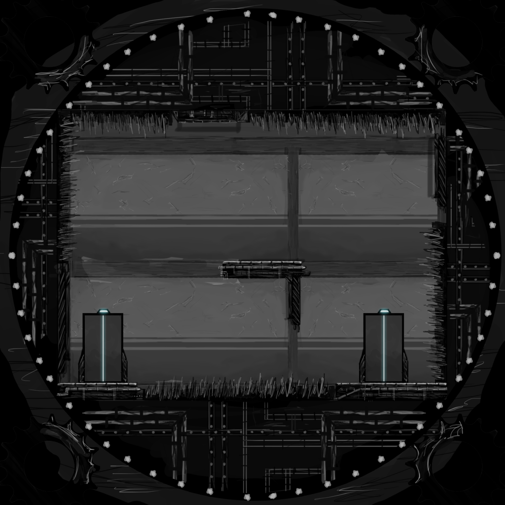
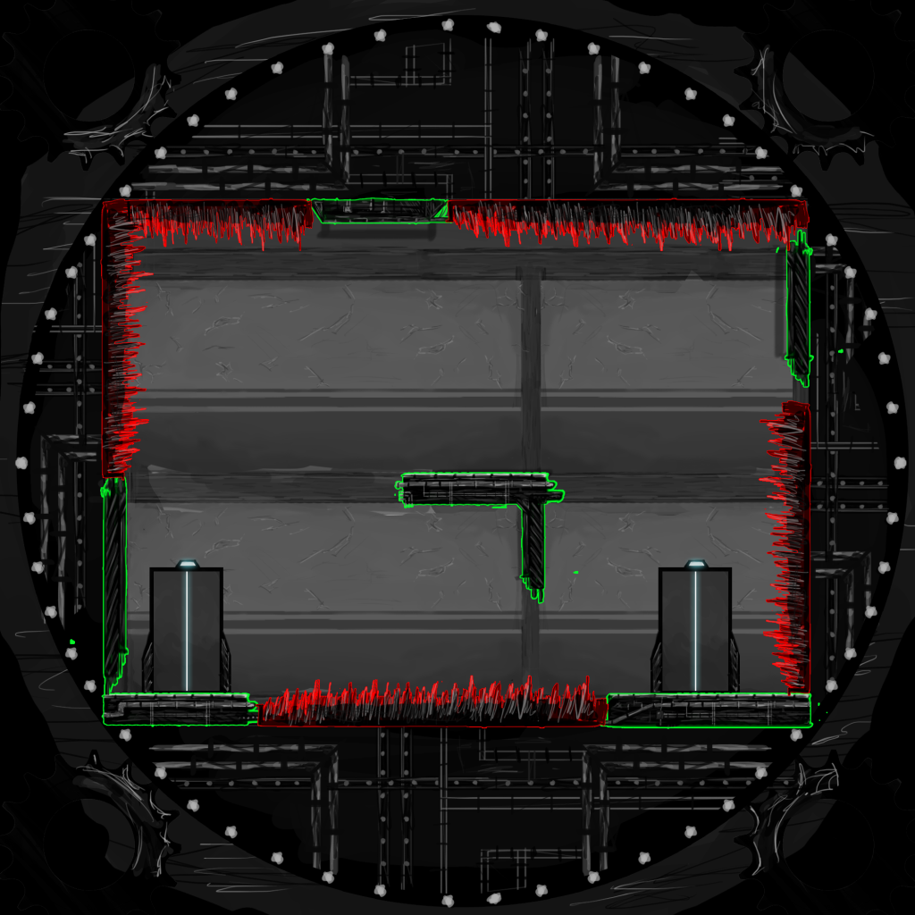
Sams Level "Ropeburn".


Made a few changes again. (Sorry Sam!)

Just because of the way I was trying to art it, joining things together and stuff to make it look a little more structured, had to do away with some areas but ive replaced them hopefully with working alternatives, nothing major, level should still work fine.


Cheers Sam.


Marks 2nd Level.

(Made a slight change in the bottom right corner, space to add a collectible now)


Monday, 12 December 2011

Marks 1st level.

Sunday, 11 December 2011


SO, Im finally done with Adams crazy level design. I had to make a few changes. Some strucural and some gameplay wise (since I actually "played" this level by moving my image of a man through it and rotating it as I went.) This is the final product.


Still very close to Adams, just with a few adjustments I felt were needed, hope he doesnt mind.

Ive also made a storyboard version, which hopefully with words will come together to make sense.

All the images in order are here if you want a bash at deciphering it (be warned, its huge):


The key is basic, black areas are structurally sound and you can walk on them.


Green areas are ropes and accompanies with a green semi circle defines their swing axis (if at all, some are fixed beams).

Red is traps and dangers, like the spikes, rotating disks, fire and steam shooters etc.

And Grey is just to make things look pretty, background / foreground images, not interactive.

The goal of the level is simple, to reach the end, however it comes with a nice side passage to pick up one of the collectibles (notes and stuff) down in the bottom left corner. The storyboard route takes you to the secret note location and with words, should hopefully make some sense.


Thanks Adam for the level design, yours was certainly the most complex and took me a good while to get the feel of it from this:


Like an evil genius scrawling his death-ray blueprints on the back of a napkin.

All in all though, I actually really like the level. it wasn't until I saw it built in my head though before it became a level, but, its actually pretty cool and most importantly, I think it will work.

So, good job Adam.

And good job Jonny, obviously.

Also, if anyone is interested in my rough animation, to give me an idea of what would work in the level ,its here still:

http://fc08.deviantart.net/fs71/f/2011/345/6/3/adamception_by_jonii_gakou-d4itrl5.swf

Hard to follow but did its job. 

Sweet Success.


Tuesday, 6 December 2011

Could not be arsed describing with words, so I made this adorable video.


That's cartoon Harland, doing some cartoon stuffs`.


Pretty much obvious whats going on in the video. Remember the player would have some-control over the movement of the player whilst in mid air, even if its only minute.

Here, in this level example, the player has access to a 90 degree rotation shift in either the right or left direction.

Hope you see what I meant when I said about the difference between the slow and angular movements.

Thanks to Mark for the Level Design, I think it worked quite nicely, good to introduce the player to the rotation mechanic and get them thinking upside-downy. 

Well that's clearly enough work for tonight.

Sweet success.

Drew up the Level Plan Mark gave me, not really happy with the outcome of the drawing, but don't really have time to worry about that.

Looks, meh.


Also made one with some highlights on the safe platform zones and the hazard spikes. Can see it  a little easier with the highlights, not a fault with the level just the way I drew it with the harsh black and grey tones, made it confusing to look at.

The in game textures will probably be in colour (Unless its up to me) so the definition and differences will be a little more obvious.


Ill do a level walk-through later, which is needed for the GDD anyway. (Unless Mark wants to do it)

 Briefly though, this level works using a 90 Degree rotation style, rather than a slow and steady rotation. Meaning when the player hits either the right or the left trigger, the room jolts 90 in the chosen direction.

Whilst this wasn't the initial idea for the game, having seen Marks level plan and spoken to Sam, it might be the best way to go about creating the gameplay. Although I'm holding off judgement until we get the prototype up and running and we can test to see whats best.

Ill speak to everyone in class about it, because I doubt anyone of you will read this far.

Ill be drawing up Sams level plans in this style as well as my own soon, so if you dislike the way I'm going let me know ASAP.

Sweet success. 


Here is the current look for the HUB world of the game, albeit looking a little bare. Can stay as this for now, Ive not got time to fully concept art it up ready for the GDD, but this will serve as a simple guide to understand what is placed where.

Ill do a better drawn version when I get some time. 


Noted all over one aswell to give you an idea of my thoughts:


Let me know what you think, anything I should add or remove and if you like the sizes of things. IE if rooms should be taller, shorter, longer etc.


Thats all for now.