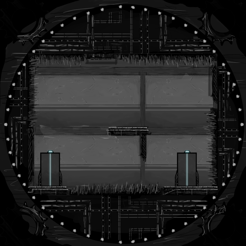
Drew up the Level Plan Mark gave me, not really happy with the outcome of the drawing, but don't really have time to worry about that.
Looks, meh.
Looks, meh.
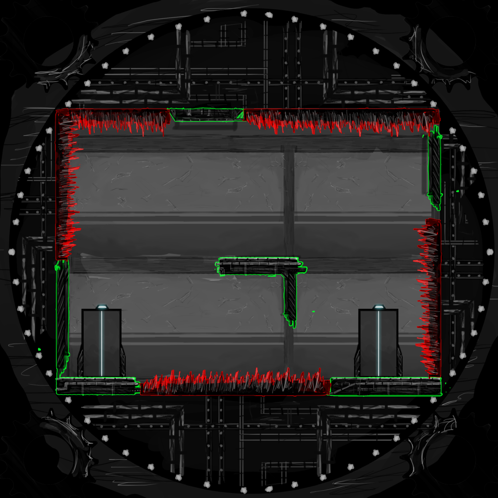
Also made one with some highlights on the safe platform zones and the hazard spikes. Can see it a little easier with the highlights, not a fault with the level just the way I drew it with the harsh black and grey tones, made it confusing to look at.
The in game textures will probably be in colour (Unless its up to me) so the definition and differences will be a little more obvious.
The in game textures will probably be in colour (Unless its up to me) so the definition and differences will be a little more obvious.
Ill do a level walk-through later, which is needed for the GDD anyway. (Unless Mark wants to do it)
Briefly though, this level works using a 90 Degree rotation style, rather than a slow and steady rotation. Meaning when the player hits either the right or the left trigger, the room jolts 90 in the chosen direction.
Whilst this wasn't the initial idea for the game, having seen Marks level plan and spoken to Sam, it might be the best way to go about creating the gameplay. Although I'm holding off judgement until we get the prototype up and running and we can test to see whats best.
Ill speak to everyone in class about it, because I doubt anyone of you will read this far.
Ill be drawing up Sams level plans in this style as well as my own soon, so if you dislike the way I'm going let me know ASAP.
Sweet success.


I tried to make a level so I could feel what was wrong with the behind the screen stuff and had a go with Marks level.
ReplyDeletehttp://www.youtube.com/watch?v=Q7aViYvMaWg
I don't have any art assets so it's all done in paint and looks terribad. Found some things I need to change, but you can see it 'in-game'